Imagine that you’re a software developer for an online retailer named eShop. The retailer uses a microservices-based architecture that’s native to the cloud, and uses .NET for its online storefront. The solution includes a NET API referred to as the product service. The store service makes calls to the backend products API to get details of the products for sale.
This module focuses on resiliency, which is the ability of an application or service to handle problems. Resiliency helps make your app fault-tolerant in a way that has the lowest possible impact on the user. The following resilience approaches are explored:
Using a code-based approach
Using an infrastructure-based approach
You’ll modify the app to include some code-based resiliency handling policies in a microservice. You’ll also reconfigure your Azure Kubernetes Service (AKS) deployment to implement an infrastructure-based solution.
You use your own Azure subscription to deploy the resources in this module. If you don’t have an Azure subscription, create a free account before you begin.
Important
To avoid unnecessary charges in your Azure subscription, be sure to delete your Azure resources when you’re done with this module.
Development container
This module includes configuration files that define a , or dev container. Using a dev container ensures a standardized environment that’s preconfigured with the required tools.
The dev container can run in either of two environments. Before you begin, follow the steps in one of the following links to set up your environment, including installing Docker and the necessary Visual Studio Code extensions.
Learning objectives
In this module, you’ll:
Understand foundational resiliency concepts.
Observe the behavior of a microservice that has no resiliency strategy.
Implement failure handling code for HTTP requests in one microservice.
Deploy an infrastructure-based resiliency solution to an AKS cluster.
Prerequisites
Familiarity with C# and .NET development at the beginner level.
Familiarity with RESTful service concepts.
Conceptual knowledge of containers and AKS at the intermediate level.
Ability to run development containers GitHub Codespaces or in Visual Studio Code.
So far, you’ve seen two approaches to support CI/CD for your cloud-native app. You manually deployed the app to AKS, and you used GitHub Actions to build and deploy the app. Microsoft supports a third approach, Azure Pipelines. Both the automated approaches are valid; you choose the one that best fits your needs.
How are GitHub actions and Azure Pipelines different?
Let’s start by looking at how these two approaches are the same. GitHub Actions and Azure Pipelines are both CI/CD tools. They both support:
Building and deploying your app.
YAML files to define the steps to build and deploy your app.
Triggers to start the build and deploy process.
Monitoring the build and deploy process.
Rolling back a deployment.
The different levels of support for features are where the two approaches vary. Let’s look at these differences.
GitHub Actions
Azure Pipelines
Free for public repositories
Free for open source projects
Free for up to 2000 minutes per month for private repositories
Free for up to 1800 minutes per month for private repositories
Limited to 20 concurrent jobs
Limited to 10 concurrent jobs
Azure Pipelines has an advantage over GitHub Actions as it supports many different source repositories. Azure Pipelines supports GitHub, GitHub Enterprise Server, Bitbucket Cloud, Azure Repos Git and TFVC, Subversion, and External Git. GitHub Actions only support GitHub.
If you have more complex CD/CD workflows, Azure Pipelines can be scaled to support your needs. Azure Pipelines supports multiple stages, multiple jobs, and multiple steps. GitHub Actions only support a single job with multiple steps. This flexibility can be combined with automated testing scenarios.
Note
When you create a new project in DevOps the free Azure Pipeline minutes might not be available. To request a free parallelism grant, fill out the parallelism request form. You’ll need to do that before completing the next exercise.
Disable your GitHub Action
After reviewing the differences, you decide to change your app to use Azure Pipelines.
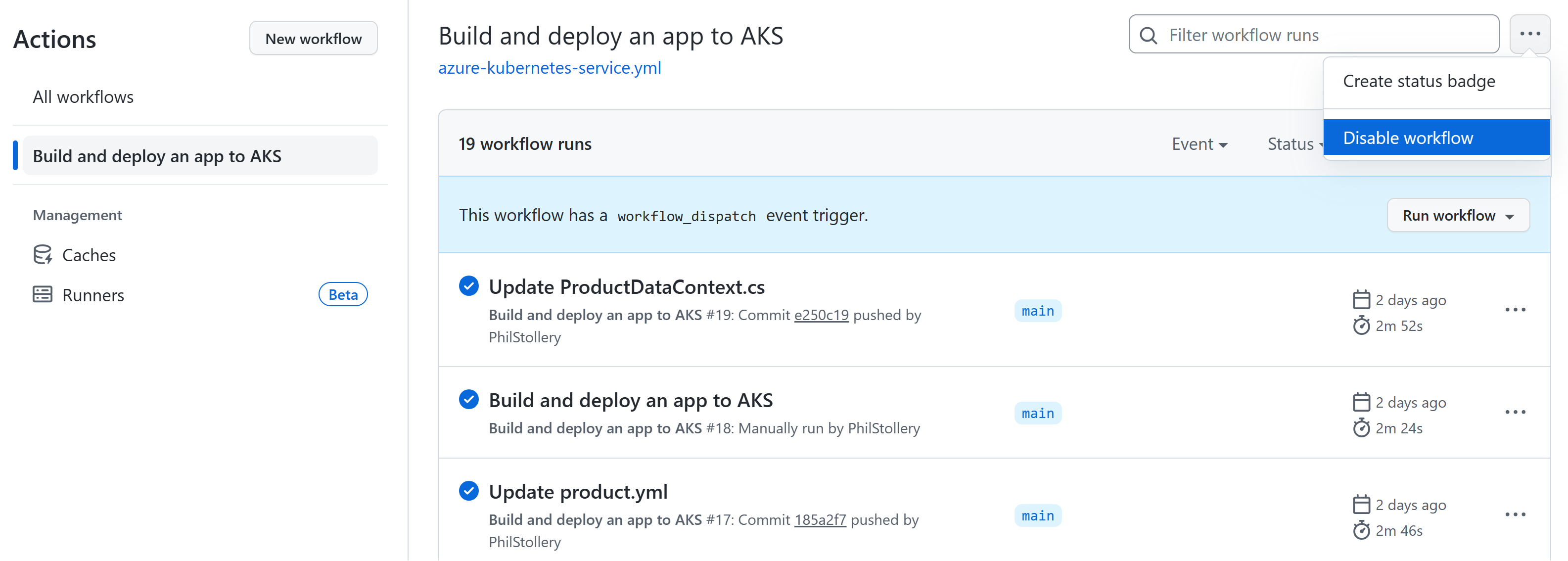
Go to your forked repository on the Actions tab.
Select the Build and deploy an app to AKS workflow.
Select the more options menu in the top right.
Select Disable workflow.
You’ve disabled the GitHub Action workflow. You’ll now create an Azure Pipeline to build and deploy your app.
Next unit: Exercise – Create an Azure DevOps pipeline to deploy your cloud-native app
Before you can automate your website deployments, you need to deploy the existing eShop app manually to Azure Kubernetes Service (AKS). You create the Azure resources and deploy the app to AKS using Azure CLI commands and bash scripts. Finally, you create an Azure Active Directory (Azure AD) service principal to allow GitHub Actions to deploy to AKS and Azure Container Registry.
The commands create the following resources to deploy an updated version of the eShop app.
Provision an Azure Container Registry (ACR) and then push images into the registry.
Provision an AKS cluster, and then deploy the containers into the cluster.
Test the deployment.
Create service principals to allow GitHub Actions to deploy to AKS and Azure Container Registry.
Important
Make sure you’ve completed the prerequisites before you begin.
Open the development environment
You can choose to use a GitHub codespace that hosts the exercise, or complete the exercise locally in Visual Studio Code.
GitHub Codespaces Setup
Fork the repository to your own GitHub account. Then on your new fork:
Select Code.
Select the Codespaces tab.
Select the + icon to create your codespace.
GitHub takes several minutes to create and configure the codespace. When the process completes, you see the code files for the exercise.
Optional: Visual Studio Code Setup
To use Visual Studio Code, fork the repository to your own GitHub account and clone it locally. Then:
Install any to run Dev Container in Visual Studio Code.
Make sure Docker is running.
In a new Visual Studio Code window, open the folder of the cloned repository
Press Ctrl+Shift+P to open the command palette.
Search: >Dev Containers: Rebuild and Reopen in Container
Visual Studio Code creates your development container locally.
Build containers
In the terminal pane, run this dotnet CLI command:.NET CLICopydotnet publish /p:PublishProfile=DefaultContainer
Create the Azure resources
In the terminal pane, sign in to Azure with this Azure CLI command:Azure CLICopyaz login --use-device-code
View the selected Azure subscription.Azure CLICopyaz account show -o table If the wrong subscription is selected, use the az account set command to select the correct one.
Run the following Azure CLI command to get a list of Azure regions and the Name associated with it:Azure CLICopyaz account list-locations -o table Locate a region closest to you and use it in the next step by replacing [Closest Azure region]
Run these bash statements:BashCopyexport LOCATION=[Closest Azure region] export RESOURCE_GROUP=rg-eshop export CLUSTER_NAME=aks-eshop export ACR_NAME=acseshop$SRANDOM The previous commands create environment variables that you’ll use in the next Azure CLI commands. You need to change the LOCATION to an Azure region close to you such as eastus. If you’d like a different name for your resource group, AKS cluster, or ACR, change those values. To view your new repositories in the Azure portal, assign yourself as App Compliance Automation Administrator in the Access control (IAM) of the container registry.
Run these Azure CLI commands:Azure CLICopyaz group create --name $RESOURCE_GROUP --location $LOCATION az acr create --resource-group $RESOURCE_GROUP --name $ACR_NAME --sku Basic az acr login --name $ACR_NAME If you receive an authentication error when az acr login --name $ACR_Name is run, you need to turn on Admin user in the newly created container register in Azure under Settings – Access Keys. Azure prompts you to enter these credentials to continue. You may also need to authenticate again with az login --use-device-code.These commands create a resource group to contain the Azure resources, an ACR for your images, and then logins into the ACR. It can take a few minutes until you see this output:ConsoleCopy ... }, "status": null, "systemData": { "createdAt": "2023-10-19T09:11:51.389157+00:00", "createdBy": "", "createdByType": "User", "lastModifiedAt": "2023-10-19T09:11:51.389157+00:00", "lastModifiedBy": "", "lastModifiedByType": "User" }, "tags": {}, "type": "Microsoft.ContainerRegistry/registries", "zoneRedundancy": "Disabled" } Login Succeeded
To tag your images and push them to the ACR you created, run these commands:BashCopydocker tag store $ACR_NAME.azurecr.io/storeimage:v1 docker tag products $ACR_NAME.azurecr.io/productservice:v1 docker push $ACR_NAME.azurecr.io/storeimage:v1 docker push $ACR_NAME.azurecr.io/productservice:v1 You can check pushing the images completes successfully with this command:BashCopyaz acr repository list --name $ACR_NAME --output table
Create your AKS and connect it to the ACR with these commands:BashCopyaz aks create --resource-group $RESOURCE_GROUP --name $CLUSTER_NAME --node-count 1 --generate-ssh-keys --node-vm-size Standard_B2s --network-plugin azure --attach-acr $ACR_NAME az aks get-credentials --name $CLUSTER_NAME --resource-group $RESOURCE_GROUP The commands create a single node AKS cluster, connect it to the ACR, and then connect your local machine to the AKS cluster. The commands can take a few minutes to complete.
Check that the new AKS can pull images from the ACR with this command:BashCopyaz aks check-acr --acr $ACR_NAME.azurecr.io --name $CLUSTER_NAME --resource-group $RESOURCE_GROUP You should see similar output to the following messages:ConsoleCopy[2023-10-19T13:33:09Z] Loading azure.json file from /etc/kubernetes/azure.json [2023-10-19T13:33:09Z] Checking managed identity... [2023-10-19T13:33:09Z] Cluster cloud name: AzurePublicCloud [2023-10-19T13:33:09Z] Kubelet managed identity client ID: 00001111-aaaa-2222-bbbb-3333cccc4444 [2023-10-19T13:33:09Z] Validating managed identity existance: SUCCEEDED [2023-10-19T13:33:09Z] Validating image pull permission: SUCCEEDED [2023-10-19T13:33:09Z] Your cluster can pull images from acseshop1251599299.azurecr.io! You can now run kubectl commands against your new AKS cluster. Copy the full ACR URL from the output; for example, above the URL is acseshop1251599299.
Check the status of your AKS cluster:BashCopykubectl get nodes -A You should see similar output to the following messages:ConsoleCopyNAME STATUS ROLES AGE VERSION aks-nodepool1-37200563-vmss000000 Ready agent 3h44m v1.26.6
Configure the Kubernetes deployment manifest
Now the eShop images are in the ACR you can update the AKS deployment manifest to use these new images.
In Visual Studio Code or Codespaces, from the EXPLORER panel, select the deployment.yml file in the root of the project.
Replace on line 17:ymlCopy- image: [replace with your ACR name].azurecr.io/storeimage:v1 Paste the copied ACR name from the previous step – the line should look similar to the following yaml:ymlCopy- image: acseshop1251599299.azurecr.io/storeimage:v1
Repeat these steps for line 65:ymlCopy- image: [replace with your ACR name].azurecr.io/productservice:v1 Save the file with CTRL+S.
In the terminal pane, deploy an NGINX ingress controller with the following kubernetes command:BashCopykubectl apply -f https://raw.githubusercontent.com/kubernetes/ingress-nginx/controller-v1.9.3/deploy/static/provider/cloud/deploy.yaml The kubectl command adds services and components to allow ingress into your AKS cluster. Check that the ingress is ready to run using the following kubernetes command:BashCopykubectl get services --namespace ingress-nginx You should see similar output to the following messages:ConsoleCopyNAME TYPE CLUSTER-IP EXTERNAL-IP PORT(S) AGE ingress-nginx-controller LoadBalancer 10.0.135.51 20.26.154.64 80:32115/TCP,443:32254/TCP 58s ingress-nginx-controller-admission ClusterIP 10.0.137.137 <none> 443/TCP 58s
Deploy the eShop app with this command:BashCopykubectl apply -f deployment.yml The kubectl apply command deploys the eShop app, a front-end Blazor web app and back-end REST API product service, and an ingress rule to route traffic to the correct services to your AKS cluster. Rerun this command if you receive any error on deployments.You should see similar output to the following messages:ConsoleCopydeployment.apps/storeimage created service/eshop-website created deployment.apps/productservice created service/eshop-backend created ingress.networking.k8s.io/eshop-ingress created
Check that the two microservices are deployed with this command:BashCopykubectl get pods -A You should see similar output to the following messages:ConsoleCopyNAMESPACE NAME READY STATUS RESTARTS AGE default productservice-7569b8c64-vfbfz 1/1 Running 0 3m56s default storeimage-6c7c999d7c-zsnxd 1/1 Running 0 3m56s ingress-nginx ingress-nginx-admission-create-szb8l 0/1 Completed 0 4m4s ingress-nginx ingress-nginx-admission-patch-czdbv 0/1 Completed 0 4m4s ingress-nginx ingress-nginx-controller-58bf5bf7dc-nwtsr 1/1 Running 0 4m4s
View the deployed eShop with this command:BashCopyecho "http://$(kubectl get services --namespace ingress-nginx ingress-nginx-controller --output jsonpath='{.status.loadBalancer.ingress[0].ip}')" The command returns the external IP address for the web app. Hold CTRL and click the link to open the app in a new tab.
Create a service principal for deploying from GitHub
GitHub Actions can publish container images to an Azure Container Registry. The GitHub runner therefore must have permissions to connect to Azure. The following steps create an Azure AD service principal to act as the GitHub Actions identity inside Azure.
To save your Subscription ID in an environment variable, run the following command in the terminal:Azure CLICopyexport SUBS=$(az account show --query 'id' --output tsv)
To create an Azure AD service principal to allow access from GitHub, run the following command:Azure CLICopyaz ad sp create-for-rbac --name "eShop" --role contributor --scopes /subscriptions/$SUBS/resourceGroups/$RESOURCE_GROUP --json-auth A variation of the following output appears:ConsoleCopyCreating 'Contributor' role assignment under scope '/subscriptions/ffffffff-aaaa-bbbb-6666-777777777777' The output includes credentials that you must protect. Be sure that you do not include these credentials in your code or check the credentials into your source control. For more information, see https://aka.ms/azadsp-cli { "clientId": "00001111-aaaa-2222-bbbb-3333cccc4444", "clientSecret": "abc1A~abc123ABC123abc123ABC123abc123ABC1", "subscriptionId": "00000000-0000-0000-0000-000000000000", "tenantId": "00000000-0000-0000-0000-000000000000", "activeDirectoryEndpointUrl": "https://login.microsoftonline.com", "resourceManagerEndpointUrl": "https://management.azure.com/", "activeDirectoryGraphResourceId": "https://graph.windows.net/", "sqlManagementEndpointUrl": "https://management.core.windows.net:8443/", "galleryEndpointUrl": "https://gallery.azure.com/", "managementEndpointUrl": "https://management.core.windows.net/" }
Copy the JSON output and brackets to use in the next step.
Create the GitHub secrets
The GitHub Actions runner uses credentials to interact with Container Registry and AKS. The service principal and the credentials for the container registry are sensitive information. It’s best to store sensitive information as encrypted secrets in a secure location. GitHub provides a built-in location to store secrets and other variables.
Complete the following steps to securely store the sensitive information as environment variables in your repository. Repository administrators should manage the secrets that the GitHub Actions runner can access.
In your forked GitHub repository, go to Settings > Secrets and variables > Actions.
On the Actions secrets and variables page, select New repository secret.
On the New secret page, under Name, enter AZURE_CREDENTIALS, and under Secret, enter the JSON output you copied from the terminal.The settings should look similar to the following screenshot:
Select Add secret.
You’ll use this GitHub secret in the next section to create a GitHub action to build the container image.
Imagine that you work as a software engineer for an online outdoor clothing retailer. You’re responsible for deploying and updating the retailer’s online storefront, a cloud-native, microservices-based .NET app.
To fulfill project requirements and enhance your team’s agile development practices, you decide to compare continuous integration and continuous deployment (CI/CD) through and Azure Pipelines. CI/CD pipelines use a series of automated steps to compile and deploy apps from build through all environments.
Because the current web has a microservices architecture, and each microservice deploys independently, you start by setting up CI/CD for a single service.
The .NET web API, named the product service, supports all the backend catalog features of the website. In this module, you’ll implement a CI/CD pipeline for the product service.
This module guides you through the following steps:
Authenticate GitHub Actions to a container registry.
Securely store sensitive information that GitHub Actions uses.
Implement an action to build the container image for a microservice.
Modify and commit the microservice code to trigger a build.
Implement an action to deploy the updated container to an Azure Kubernetes Service (AKS) cluster.
Modify and commit a Helm chart to trigger the deployment.
Revert the microservice to the previous deployment.
You use your own Azure subscription to deploy the resources in this module. If you don’t have an Azure subscription, create a before you begin.
Important
To avoid unnecessary charges in your Azure subscription, be sure to delete your Azure resources when you’re done with this module.
Prerequisites
Conceptual knowledge of DevOps practices.
Conceptual knowledge of containers, Docker, and AKS.
Access to an Azure subscription with Owner permissions.
Access to a GitHub account.
Ability to run development containers in Visual Studio Code or GitHub Codespaces, set up as described in the following section.
Development container
This module includes configuration files that define a , or dev container. Using a dev container ensures a standardized environment that’s preconfigured with the required tools.
Use CI/CD pipelines to build a container image and deploy it to Azure Kubernetes Service (AKS).
Learning objectives
This module guides you through the following steps:
Authenticate GitHub Actions to a container registry.
Securely store sensitive information that GitHub Actions uses.
Implement an action to build the container image for a microservice.
Modify and commit the microservice code to trigger a build.
Implement an action to deploy the updated container to an Azure Kubernetes Service (AKS) cluster.
Revert the microservice to the previous deployment.
Implement Azure Pipelines to build and deploy a microservice to Azure Kubernetes Service (AKS) cluster.
Prerequisites
Conceptual knowledge of DevOps practices.
Conceptual knowledge of containers, Docker, and AKS.
Access to an Azure subscription with Owner permissions.
Access to a GitHub account.
Access to an Azure DevOps organization.
Ability to run development containers in Visual Studio Code or GitHub Codespaces, including Docker and the necessary Visual Studio Code extensions installed.
In a form, you should provide instructions to the website user on how to complete each value properly, but you should also check the values that they enter. Blazor provides simple tools that can perform this validation with the minimum of custom code.
In this unit, you learn how to annotate models so that Blazor knows what data to expect. You also learn how to configure a form so it validates and responds to user data correctly.
Validate user input in Blazor forms
When you collect information from a website user, it’s important to check that it makes sense and is in the right form:
For business reasons: Customer information such as a telephone number or order details must be correct to give good service to users. For example, if your webpage can spot a malformed telephone number as soon as the user enters it, you can prevent costly delays later.
For technical reasons: If your code uses form input for calculations or other processing, incorrect input can cause errors and exceptions.
For security reasons: Malicious users might try to inject code by exploiting input fields that aren’t checked.
Website users are familiar with validation rules that check for the presence and correct format of the details they enter. Required fields are often marked with an asterisk or a Required label. If they omit a value or enter a poorly formatted value, they see a validation message instructing them on how to correct the problem. The validation message might appear when the user tabs out of a field or when they select the Submit button.
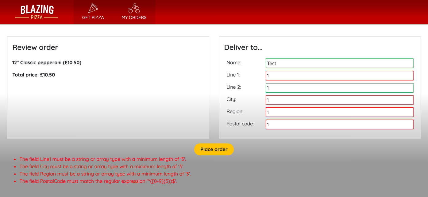
Here’s an example form where the user submits invalid data. In this case, there are validation messages at the bottom of the form and invalid fields are highlighted in red. You’ll build this form in the next exercise:
It’s a good idea to make validation messages as helpful as possible. Don’t assume any knowledge from the user; for example, not everyone knows the format of a valid email address.
When you use the EditForm component in Blazor, you have versatile validation options available without writing complex code:
In your model, you can use data annotations against each property to tell Blazor when values are required and what format they should be in.
Within your EditForm component, add the DataAnnotationsValidator component, which checks the model annotations against the user’s entered values.
Use the ValidationSummary component when you want to display a summary of all the validation messages in a submitted form.
Use the ValidationMessage component when you want to display the validation message for a specific model property.
Prepare models for validation
Start by telling the DataAnnotationsValidator component what valid data looks like. You declare validation restrictions by using annotation attributes in your data model. Consider this example:
C#Copy
using  System.ComponentModel.DataAnnotations;

public class Pizza
{
    public int Id { get; set; }

    [Required]
    public string Name { get; set; }

    public string Description { get; set; }

    [EmailAddress]
    public string ChefEmail { get; set;}

    [Required]
    [Range(10.00, 25.00)]
    public decimal Price { get; set; }
}
We use this model in a form that enables Blazing Pizza personnel to add new pizzas to the menu. It includes the [Required] attribute to ensure that the Name and Price values are always completed. It also uses the [Range] attribute to check that the price entered is within a sensible range for a pizza. Finally, it uses the [EmailAddress] attribute to check the ChefEmail value entered is a valid email address.
Other annotations that you can use in a model include:
[ValidationNever]: Use this annotation when you want to ensure that the field is never included in validation.
[CreditCard]: Use this annotation when you want to record a valid credit card number from the user.
[Compare]: Use this annotation when you want to ensure that two properties in the model match.
[Phone]: Use this annotation when you want to record a valid telephone number from the user.
[RegularExpression]: Use this annotation to check the format of a value by comparing it to a regular expression.
[StringLength]: Use this annotation to check that the length of a string value doesn’t exceed a maximum length.
[Url]: Use this annotation when you want to record a valid URL from the user.
Note
Regular expressions are widely used to compare strings against patterns and also to modify strings. You can use them to define custom formats that form values must conform to. To learn more about regular expressions in .
Add validation components to the form
To configure your form to use data-annotation validation, first make sure the input control is bound to the model properties. Then, add the DataAnnotationsValidator component somewhere within the EditForm component. To display the messages that validation generates, use the ValidationSummary component, which shows all the validation messages for all controls in the form. If you prefer to show validation messages next to each control, use multiple ValidationMessage components. Remember to tie each ValidationMessage control to a specific property of the model, by using the For attribute:
Blazor performs validation at two different times:
Field validation is executed when a user tabs out of a field. Field validation ensures that a user is aware of the validation problem at the earliest possible time.
Model validation is executed when the user submits the form. Model validation ensures that invalid data isn’t stored.
If a form fails validation, messages are displayed in the ValidationSummary and ValidationMessage components. To customize these messages, you can add an ErrorMessage attribute to the data annotation for each field in the model:
C#Copy
public class Pizza
{
    public int Id { get; set; }

    [Required(ErrorMessage = "You must set a name for your pizza.")]
    public string Name { get; set; }

    public string Description { get; set; }

    [EmailAddress(ErrorMessage = "You must set a valid email address for the chef responsible for the pizza recipe.")]
    public string ChefEmail { get; set;}

    [Required]
    [Range(10.00, 25.00, ErrorMessage = "You must set a price between $10 and $25.")]
    public decimal Price { get; set; }
}
The built-in validation attributes are versatile, and you can use regular expressions to check against many kinds of text patterns. However, if you have specific or unusual requirements for validation, you might be unable to satisfy them precisely with built-in attributes. In these circumstances, you can create a custom validation attribute. Start by creating a class that inherits from the ValidationAttribute class and overrides the IsValid method:
C#Copy
public class PizzaBase : ValidationAttribute
{
    public string GetErrorMessage() => $"Sorry, that's not a valid pizza base.";

    protected override ValidationResult IsValid(
        object value, ValidationContext validationContext)
    {
        if (value != "Tomato" || value != "Pesto")
        {
            return new ValidationResult(GetErrorMessage());
        }

        return ValidationResult.Success;
    }
}
Now, you can use your custom validation attribute as you use the built-in attributes in the model class:
C#Copy
public class Pizza
{
    public int Id { get; set; }

    [Required(ErrorMessage = "You must set a name for your pizza.")]
    public string Name { get; set; }

    public string Description { get; set; }

    [EmailAddress(
        ErrorMessage = "You must set a valid email address for the chef responsible for the pizza recipe.")]
    public string ChefEmail { get; set;}

    [Required]
    [Range(10.00, 25.00, ErrorMessage = "You must set a price between $10 and $25.")]
    public decimal Price { get; set; }

    [PizzaBase]
    public string Base { get; set; }
}
Handle form validations server-side on form submission
When you use an EditForm component, three events are available for responding to form submission:
OnSubmit: This event fires whenever the user submits a form, regardless of the results of validation.
OnValidSubmit: This event fires when the user submits a form and their input passes validation.
OnInvalidSubmit: This event fires when the user submits a form and their input fails validation.
If you use OnSubmit, the other two events aren’t fired. Instead, you can use the EditContext parameter to check whether to process the input data or not. Use this event when you want to write your own logic to handle form submission:
Users enter data using forms. In a classic web app, you create a form using the <form> element, and enable the user to provide data using <input> elements. When the user submits the form, the input can be validated. If the validation is successful, the appropriate actions can then be taken, such as using the information provided to add a new entry to a database or to update a record.
The facilities the <form> and <input> elements provide are simple but relatively primitive. Blazor extends the capabilities of forms with its <EditForm> component. Additionally, Blazor provides a series of specialized input elements that you can use to format and validate the data the user enters.
In this unit, you learn how to use the <EditForm> element and the input elements to build functional forms. You also see how to use data binding with a form.
What is an EditForm?
An EditForm is a Blazor component that fulfills the role of an HTML form on a Blazor page. The main differences between an EditForm and an HTML form are:
Data binding: You can associate an object with an EditForm. The EditForm acts like a view of the object for data entry and display purposes.
Validation: An EditForm provides extensive and extensible validation capabilities. You can add attributes to the elements in an EditForm that specify validation rules. The EditForm applies these rules automatically. This functionality is described in a later unit in this module.
Form submission: An HTML form sends a post request to a form handler when the form is submitted. This form handler is expected to perform the submit process, and then display any results. An EditForm follows the Blazor event model; you specify a C# event handler that captures the OnSubmit event. The event handler performs the submit logic.
Input elements: An HTML form uses an <input> control to gather user input, and a submit button to post the form for processing. An EditForm can use these same elements, but Blazor provides a library of input components that have other features, such as built-in validation and data binding.
Create an EditForm with data binding
The <EditForm> element supports data binding with the Model parameter. You specify an object as the argument for this parameter. The input elements in the EditForm can bind to properties and fields exposed by the model by using the @bind-Value parameter. The following example is based on the WeatherForecast class created by the default Blazor Server App template. The class looks like this:
C#Copy
public class WeatherForecast
{
    public DateTime Date { get; set; }

    public int TemperatureC { get; set; }

    public int TemperatureF => 32 + (int)(TemperatureC / 0.5556);

    public string Summary { get; set; }
}
The model for the EditForm is an instance of the WeatherForecast class stored in the @currentForecast variable, and the input elements are bound to the fields in the class:
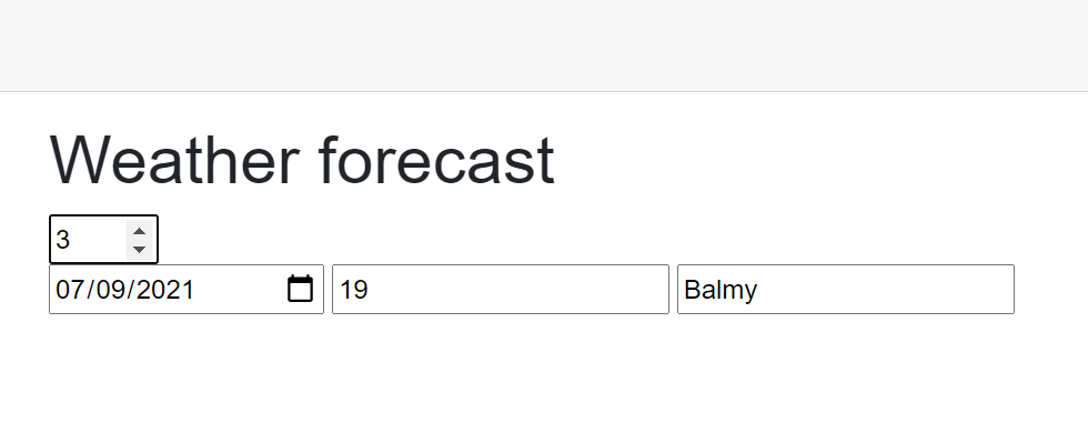
In this example, the OnInitialized event populates an array of WeatherForecast objects by using an external service. The currentForecast variable is set to the first item in the array; which is the object displayed by the EditForm. The user can cycle through the array using the numeric input field above the EditForm on the page. This field’s value is used as an index of the array, and the currentForecast variable is set to the object found at that index by using the ChangeForecast method.
The following image shows an example of the page running:
Important
The EditForm component implements two-way data binding. The form displays the values retrieved from the mode. However, if the user updates these values in the form, the values are pushed back to the model.
Understand Blazor input controls
The HTML <form> element supports the <input> element to enable the user to enter data. The <input> has a type property that specifies the type of the input and how it should be displayed; as a number, a text box, a radio button, a check box, a button, and so on.
Blazor has its own set of components designed to work specifically with the <EditForm> element and support data binding among other features. The following table lists these components. When Blazor renders a page containing these components, they’re converted to the corresponding HTML <input> elements listed in the table. Some of the Blazor components are generic; the Blazor runtime ascertains the type parameter depending on the type of the data bound to the element:
Input component
Rendered as (HTML)
InputCheckbox
<input type="checkbox">
InputDate<TValue>
<input type="date">
InputFile
<input type="file">
InputNumber<TValue>
<input type="number">
InputRadio<TValue>
<input type="radio">
InputRadioGroup<TValue>
Group of child radio buttons
InputSelect<TValue>
<select>
InputText
<input>
InputTextArea
<textarea>
Each of these elements has attributes that Blazor recognizes. Examples such as DisplayName, which is used to associate an input element with a label, and @ref, which you can use to save a reference to a field in a C# variable. Any unrecognized non-Blazor attributes are passed unchanged to the HTML renderer. This means you can utilize HTML input element attributes. For example, you can add the min, max, and step attributes to an InputNumber component, and they function correctly as part of the rendered <input type="number"> element. In the previous example, you could specify the TemperatureC input field as:
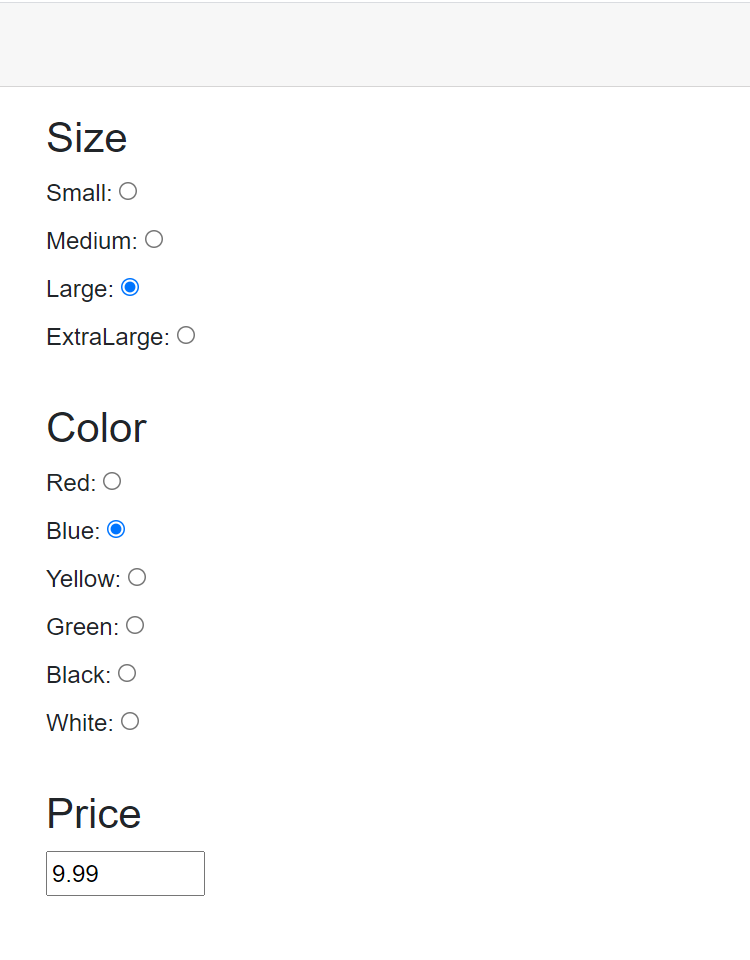
The next example shows how to use the InputRadioGroup<TValue> and InputRadio<TValue> components. You typically use a radio button group to present a series of radio buttons. Each button enables the user to select one value from a given set. An EditForm can contain multiple RadioButtonGroup<TValue> components, and each group can be bound to a field in the model for the EditForm. The following example presents details from a clothing-store app. The form displays data for T-shirts. The Shirt model class looks like this:
C#Copy
public enum ShirtColor
{
    Red, Blue, Yellow, Green, Black, White
};

public enum ShirtSize
{
    Small, Medium, Large, ExtraLarge
};

public class Shirt
{
    public ShirtColor Color { get; set; }
    public ShirtSize Size { get; set; }
    public decimal Price;
}
Notice that the color and size of the T-shirt are specified as enumerations. In the following Razor page, the code creates a Shirt object to act as test data. The <EditForm> element is bound to this object. The form displays the size, color, and price of the T-shirt. The first <InputRadioGroup> element is attached to the Size property. The foreach loop iterates through the possible values in the enumeration and creates a <InputRadio> element for each one. The Name attribute of the <InputRadio> element must match that of the <InputRadioGroup> element; the HTML renderer uses this attribute to tie the group and radio buttons together. The second <InputRadioGroup> element is attached to the Color property, and uses the same technique to generate radio buttons for each size. The final element displays the price using an <InputNumber> element. This element applies the max, min, and step attributes available with the HTML <input> element. This example uses <label> elements to display the name of the value associated with each component.
You saw that you can use an EditForm to modify data in the underlying model. When the changes are complete, you can submit the form to validate the data on the server and save the changes. Blazor supports two types of validation; declarative and programmatic. Declarative validation rules operate on the client, in the browser. They’re useful for performing basic client-side validation before data is transmitted to the server. Server-side validation is useful for handling complex scenarios that aren’t available with declarative validation, such as cross-checking the data in a field against data from other sources. A real-world application should utilize a combination of client-side and server-side validation. The client-side validation traps basic user input errors and prevents many cases of invalid data being sent to the server for processing. Server-side validation ensures that a user request to save data doesn’t attempt to bypass data validation and store incomplete or corrupt data.
Note
You can also trap JavaScript events such as onchange and oninput, and the Blazor equivalent @onchange and @oninput events for many controls in an EditForm. You can use these events to examine and validate data programmatically, on a field-by-field basis, before the user submits the form. However, this approach isn’t recommended. It can be frustrating to a user to have validation messages appear as they enter each keystroke or tab between fields. Save validation for after the user completes their input.
When an EditForm is submitted, it runs these three events:
OnValidSubmit: This event is triggered if the input fields successfully pass the validation rules defined by their validation attributes.
OnInvalidSubmit: This event is triggered if any of the input fields on the form fail the validation defined by their validation attributes.
OnSubmit: This event occurs when the EditForm is submitted regardless of whether all of the input fields are valid or not.
The OnValidSubmit and OnInvalidSubmit events are useful for an EditForm that implements basic validation at the individual input field level. If you have more complex validation requirements, such as cross-checking one input field against another to ensure a valid combination of values, then consider using the OnSubmit event. An EditForm can either handle the OnValidSubmit and OnInvalidSubmit pair of events or the OnSubmit event but not all three. You trigger submission by adding a Submit button to the EditForm. When the user selects this button, the submit events specified by the EditForm are triggered.
Note
The build and deploy process doesn’t check for an invalid combination of submit events, but an illegal selection generates an error at runtime. For example, if you attempt to use OnValidSubmit with OnSubmit, your application generates the following runtime exception:
textCopy
Error: System.InvalidOperationException: When supplying an OnSubmit parameter to EditForm, do not also supply OnValidSubmit or OnInvalidSubmit.
The EditForm tracks the state of the current object that is acting as a model, including which fields were changed and their current values, by using an EditContext object. The EditContext object is passed to the submit events as a parameter. An event handler can use the Model field in this object to retrieve the user’s input.
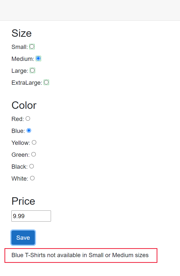
The following example shows the EditForm from the previous example with a submit button. The EditForm captures the OnSubmit event to validate the changes made to a T-shirt object. In this example, only certain combinations of values are allowed:
Red T-shirts aren’t available in the Extra Large size.
Blue T-shirts aren’t available in the Small or Medium sizes.
White T-shirts have a maximum price of $50.
If an illegal combination is detected, the Message field on the form displays the reason for the validation failure. If the fields are valid, the data is processed and the data is saved (the logic for this process isn’t shown).
razorCopy
<EditForm Model="@shirt" OnSubmit="ValidateData">
    <!-- Omitted for brevity -->
    <input type="submit" class="btn btn-primary" value="Save"/>
    <p></p>
    <div>@Message</div>
</EditForm>

@code {
    private string Message = String.Empty;

    // Omitted for brevity

    private async Task ValidateData(EditContext editContext)
    {
        if (editContext.Model isn't Shirt shirt)
        {
            Message = "T-Shirt object is invalid";
            return;
        }

        if (shirt is { Color: ShirtColor.Red, Size: ShirtSize.ExtraLarge })
        {
            Message = "Red T-Shirts not available in Extra Large size";
            return;
        }

        if (shirt is { Color: ShirtColor.Blue, Size: <= ShirtSize.Medium)
        {
            Message = "Blue T-Shirts not available in Small or Medium sizes";
            return;
        }

        if (shirt is { Color: ShirtColor.White, Price: > 50 })
        {
            Message = "White T-Shirts must be priced at 50 or lower";
            return;
        }

        // Data is valid
        // Save the data
        Message = "Changes saved";
    }
}
The following image shows the results if the user attempts to provide invalid data:
Most HTML elements expose events that are triggered when something significant happens. Such as, when a page finishes loading, the user clicks a button, or the contents of an HTML element are changed. An app can handle an event in several ways:
The app can ignore the event.
The app can run an event handler written in JavaScript to process the event.
The app can run a Blazor event handler written in C# to process the event.
In this unit, you get a detailed look at the third option; how to create a Blazor event handler in C# to process an event.
Handle an event with Blazor and C#
Each element in the HTML markup of a Blazor app supports many events. Most of these events correspond to the DOM events available in regular web applications, but you can also create user-defined events that are triggered by writing code. To capture an event with Blazor, you write a C# method that handles the event, then bind the event to the method with a Blazor directive. For a DOM event, the Blazor directive shares the same name as the equivalent HTML event, such as @onkeydown or @onfocus. For example, the sample app generated by using the Blazor Server App contains the following code on the Counter.razor page. This page displays a button. When the user selects the button, the @onclick event triggers the IncrementCount method that increments a counter indicating how many times the button was clicked. The <p> element on the page displays the value of the counter variable:
Many event handler methods take a parameter that provides extra contextual information. This parameter is known as an EventArgs parameter. For example, the @onclick event passes information about which button the user clicked, or whether they pressed a button such as Ctrl or Alt at the same time as clicking the button, in a MouseEventArgs parameter. You don’t need to provide this parameter when you call the method; the Blazor runtime adds it automatically. You can query this parameter in the event handler. The following code increments the counter shown in the previous example by five if the user presses the Ctrl key at the same time as clicking the button:
Other events provide different EventArgs parameters. For instance, the @onkeypress event passes a KeyboardEventArgs parameter that indicates which key the user pressed. For any of the DOM events, if you don’t need this information, you can omit the EventArgs parameter from the event handling method.
Understand event handling in JavaScript versus event handling with Blazor
A traditional web application uses JavaScript to capture and process events. You create a function as part of an HTML <script> element, and then arrange to call that function when the event occurs. For comparison with the preceding Blazor example, the following code shows a fragment from an HTML page that increments a value and displays the result whenever the user selects the Click me button. The code makes use of the jQuery library to access the DOM.
Besides the syntactic differences in the two versions of the event handler, you should note the following functional differences:
JavaScript doesn’t prefix the name of the event with an @ sign; it’s not a Blazor directive.
In the Blazor code, you specify the name of the event-handling method when you attach it to an event. In JavaScript, you write a statement that calls the event-handling method; you specify round brackets and any parameters required.
Most importantly, the JavaScript event handler runs in the browser, on the client. If you’re building a Blazor Server App, the Blazor event handler runs on the server and only updates the browser with any changes made to the UI when the event handler completes. Additionally, the Blazor mechanism enables an event handler to access static data shared between sessions; the JavaScript model doesn’t. However, handling some frequently occurring events such as @onmousemove can cause the user interface to become sluggish because they require a network round-trip to the server. You might prefer to handle events such as these in the browser, using JavaScript.
Important
You can manipulate the DOM using JavaScript code from an event handler and by using C# Blazor code. However, Blazor maintains its own copy of the DOM, which is used to refresh the user interface when required. If you use JavaScript and Blazor code to change the same elements in the DOM, you run the risk of corrupting the DOM. You can also possibly compromise the privacy and security of the data in your web app.
Handle events asynchronously
By default, Blazor event handlers are synchronous. If an event handler performs a potentially long-running operation, such as calling a web service, the thread on which the event handler runs is blocked until the operation completes. This situation can lead to poor response in the user interface. To combat this problem, you can designate an event handler method as asynchronous. Use the C# async keyword. The method must return a Task object. You can then use the await operator inside the event handler method to initiate any long-running tasks on a separate thread and free the current thread for other work. When a long-running task completes, the event handler resumes. The following example shows an event handler that runs a time-consuming method asynchronously:
razorCopy
<button @onclick="DoWork">Run time-consuming operation</button>

@code {
    private async Task DoWork()
    {
        // Call a method that takes a long time to run and free the current thread
        var data = await timeConsumingOperation();

        // Omitted for brevity
    }
}
Note
For detailed information about creating asynchronous methods in C#, read
Use an event to set the focus to a DOM element
On an HTML page, the user can tab between elements, and the focus naturally travels in the order in which the HTML elements appear on the page. On some occasions, you might need to override this sequence and force the user to visit a specific element.
The simplest way to perform this task is to use the FocusAsync method. This method is an instance method of an ElementReference object. The ElementReference should reference the item to which you want to set the focus. You designate an element reference with the @ref attribute and create a C# object with the same name in your code.
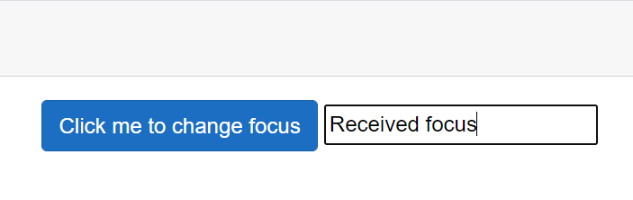
In the following example, the @onclick event handler for the <button> element sets the focus on the <input> element. The @onfocus event handler of the <input> element displays the message “Received focus” when the element gets the focus. The <input> element is referenced through the InputField variable in the code:
The following image shows the result when the user selects the button:
Note
An app should only direct the focus to a specific control for a specific reason, such as to ask the user to modify input after an error. Don’t use focusing to force the user to navigate through the elements on a page in a fixed order. This design can be frustrating to the user who might want to revisit elements to change their input.
Write inline event handlers
C# supports lambda expressions. A lambda expression enables you to create an anonymous function. A lambda expression is useful if you have a simple event handler that you don’t need to reuse elsewhere in a page or component. In the initial click count example shown at the start of this unit, you can remove the IncrementCount method, and instead replace the method call with a lambda expression that performs the same task:
This approach is also useful if you want to provide other arguments for an event-handling method. In the following example, the method HandleClick takes a MouseEventArgs parameter in the same way as an ordinary click event handler, but it also accepts a string parameter. The method processes the click event as before, but also displays the message if the user presses the Ctrl key. The lambda expression calls the HandleCLick method, passing in the MouseEventArgs parameter (mouseEvent), and a string.
This example uses the JavaScript alert function to display the message because there’s no equivalent function in Blazor. You use JavaScript interop to call JavaScript from Blazor code. The details of this technique are the subject of a separate module.
Override default DOM actions for events
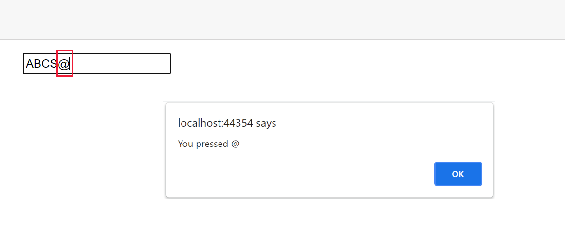
Several DOM events have default actions that run when the event occurs, regardless of whether there’s an event handler available for that event. For example, the @onkeypress event for an <input> element always displays the character that corresponds to the key pressed by the user and then handles the key press. In the next example, the @onkeypress event is used to convert the user’s input to uppercase. Additionally, if the user types an @ character, the event handler displays an alert:
If you run this code and press the @ key, the alert is displayed, but the @ character is also added to the input. The addition of the @ character is the default action of the event.
If you want to suppress this character from appearing in the input box, you can override the default action with the preventDefault attribute of the event, like this:
The event still fires, but only the actions defined by the event handler are performed.
Some events in a child element in the DOM can trigger events in their parent elements. In the following example, the <div> element contains an @onclick event handler. The <button> inside the <div> has its own @onclick event handler. Additionally, the <div> contains an <input> element:
When the app runs, if the user clicks any element (or empty space) in the area occupied by the <div> element, the method HandleDivClick runs and displays a message. If the user selects the Click me button, the IncrementCount method runs, followed by HandleDivClick; the @onclick event propagates up the DOM tree. If the <div> was part of another element that also handled the @onclick event, that event handler would also run, and so on, to the root of the DOM tree. You can curtail this upwards proliferation of events with the stopPropagation attribute of an event, as shown here:
Use an EventCallback to handle events across components
A Blazor page can contain one or more Blazor components, and components can be nested in a parent-child relationship. An event in a child component can trigger an event-handler method in a parent component by using an EventCallback. A callback references a method in the parent component. The child component can run the method by invoking the callback. This mechanism is similar to using a delegate to reference a method in a C# application.
A callback can take a single parameter. EventCallback is a generic type. The type parameter specifies the type of the argument passed to the callback.
As an example, consider the following scenario. You want to create a component named TextDisplay that enables the user to enter an input string and transform that string in some way. You might want to convert it to upper case, lower case, mixed case, filter characters from it, or perform some other type of transformation. However, when you write the code for the TextDisplay component, you don’t know what the transformation process is going to be. Instead, you want to defer this operation to another component. The following code shows the TextDisplay component. It provides the input string in the form of an <input> element that enables the user to enter a text value.
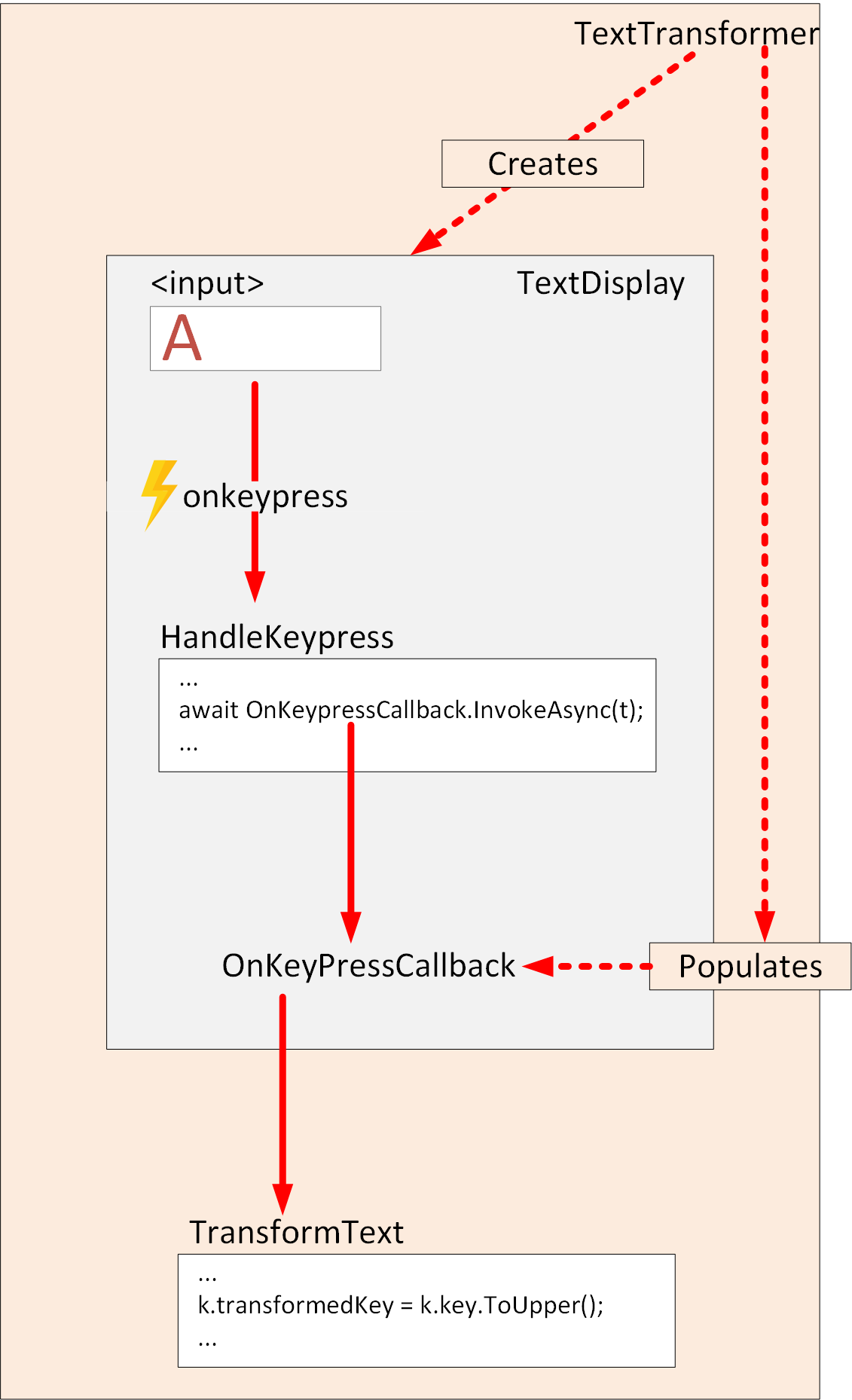
The TextDisplay component uses an EventCallback object named OnKeyPressCallback. The code in the HandleKeypress method invokes the callback. The @onkeypress event handler runs each time a key is pressed and calls the HandleKeypress method. The HandleKeypress method creates a KeyTransformation object using the key the user pressed and passes this object as the parameter to the callback. The KeyTransformation type is a simple class with two fields:
C#Copy
namespace WebApplication.Data
{
    public class KeyTransformation
    {
        public string Key { get; set; }
        public string TransformedKey { get; set; }
    }
}
The key field contains the value entered by the user, and the TransformedKey field holds the transformed value of the key after processing.
In this example, the EventCallback object is a component parameter, and its value is supplied when the component is created. The component named TextTransformer performs this action:
The TextTransformer component is a Blazor page that creates an instance of the TextDisplay component. It populates the OnKeypressCallback parameter with a reference to the TransformText method in the code section of the page. The TransformText method takes the KeyTransformation object provided as its argument, and fills in the TransformedKey property with the value found in the Key property converted to upper case. The following diagram illustrates the flow of control when a user enters a value into the <input> field in the TextDisplay component displayed by the TextTransformer page:
The beauty of this approach is that you can use the TextDisplay component with any page that provides a callback for the OnKeypressCallback parameter. There’s complete separation between the display and the processing. You can switch the TransformText method for any other callback that matches the signature of the EventCallback parameter in the TextDisplay component.
You can wire a callback up to an event handler directly without using an intermediate method if the callback is typed with the appropriate EventArgs parameter. For example, a child component might reference a callback that can handle mouse events such as @onclick like this:
Blazor enables you to create interactive web applications using .NET. You can share app logic on both the server side and client side without the complexity of managing client-side JavaScript libraries.
Suppose that a pizza-delivery firm hires you to enhance their customer-facing website. You’re asked to improve the customers’ experience when entering their address details in orders. Specifically, the company needs to stop blank addresses from appearing on orders. Some were recorded in the past and resulted in poor service to customers.
In this module, you learn about Blazor event handlers and how to use the power of Blazor forms with validation.
Learning objectives
By the end of this session, you’re able to:
Improve your app’s interactivity using Blazor event handlers.
Use Blazor forms to enable data entry.
Extend Blazor forms with server and client-side validation.